Posts

Showing posts from November, 2017

The Wizard of Oz Poster

Image
Filler Image Contrast-   The contrast is what the viewer first sees in an image, and once I got started on this assignment, I knew the title had to be the main focal point of the poster. I had first decided on using the same font as "Olathe Northwest Theatre Presents," but felt that it didn't stand out enough. It took awhile to find a font that I actually liked, but I finally decided on "Phosphate." After completing the title, I changed the color to white, as it stood out the most compared to black, yellow, and green, which were my color scheme choices for the project. Once I was done with the colors and text, I finished the contrast with the transparent image of the main characters placed behind the title on the yellow brick road to draw attention. Alignment- The majority of my alignment is either right or left aligned. The fact that I changed it all came down to how I was designing the poster. Nothing could go over the yellow bric
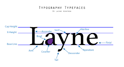
Typography

Image
Overview For this assignment, we were asked to create a typography "guide" using our names typed in a serif font. From there, we could access a typeface parts directory to help with the creation of our labels. These labels would point out the specific pieces of our names that created the font. All together, the finished product would create the overall anatomy of a typeface. What I've Learned As I was creating this project, I slowly realized how many specific parts of a word have to go into making a font. This time around on Adobe Illustrator, I learned to use both the art board and paintbrush tools. When I was about halfway through the project, I realized that since my name was a bit shorter, and I wasn't going to get all of the 10 required typefaces by only pointing out the ones on the outsides of letters. To resolve this problem, I discovered the brush feature and filled in the inside of the A. It was easier than I thought, since the tool automatically w

Logo Color Schemes

Image
  Filler Image Logo Color Schemes Analogous Colors John Deere's logo uses the analogous colors of yellow and green. I think the company probably chose these colors because green symbolizes nature, which is what the company is for. The YMCA logo uses the analogous colors of blue and violet. I think the company probably chose these colors because they are pleasing to look at, and it sparks both imagination and it leaves the customer comfortable and dependent on the company. Warm Colors   Toblerone's logo uses the warm colors of yellow and red. I think the company probably chose these colors because they're bright and positive, raising the customer's attention toward the product.    Red Bull's  logo uses the warm colors of yellow and red. I think the company probably chose these colors because it sparks your energy, just like their drink is intended to do. Cool Colors   Ocean Spray's logo uses the cool color of blue. I think